Case study · Data analysis
Logistics service quality: KPIs and alerts from the ERP
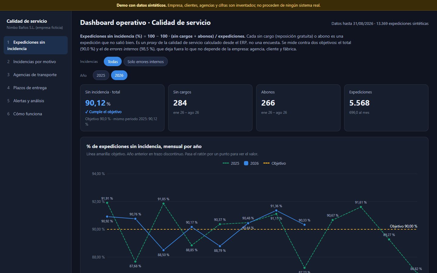
Five separate reports, which had to be refreshed by hand and flagged nothing, became a 15-tab dashboard that updates itself from SAP and writes its alerts from the data. The demo recreates 5 of those tabs with synthetic data.
The problem
Service quality was tracked in separate Power BI files. They had to be refreshed by hand and compared by eye. A simple question, “is this incident reason really getting worse or does it only look that way?”, had no direct answer.
What it does
A Python generator reads read-only SQL on SAP and the exports from carriers and the B2B portal, calculates everything with pure functions and publishes a single data file. The website has no dependencies and opens from OneDrive without a server.
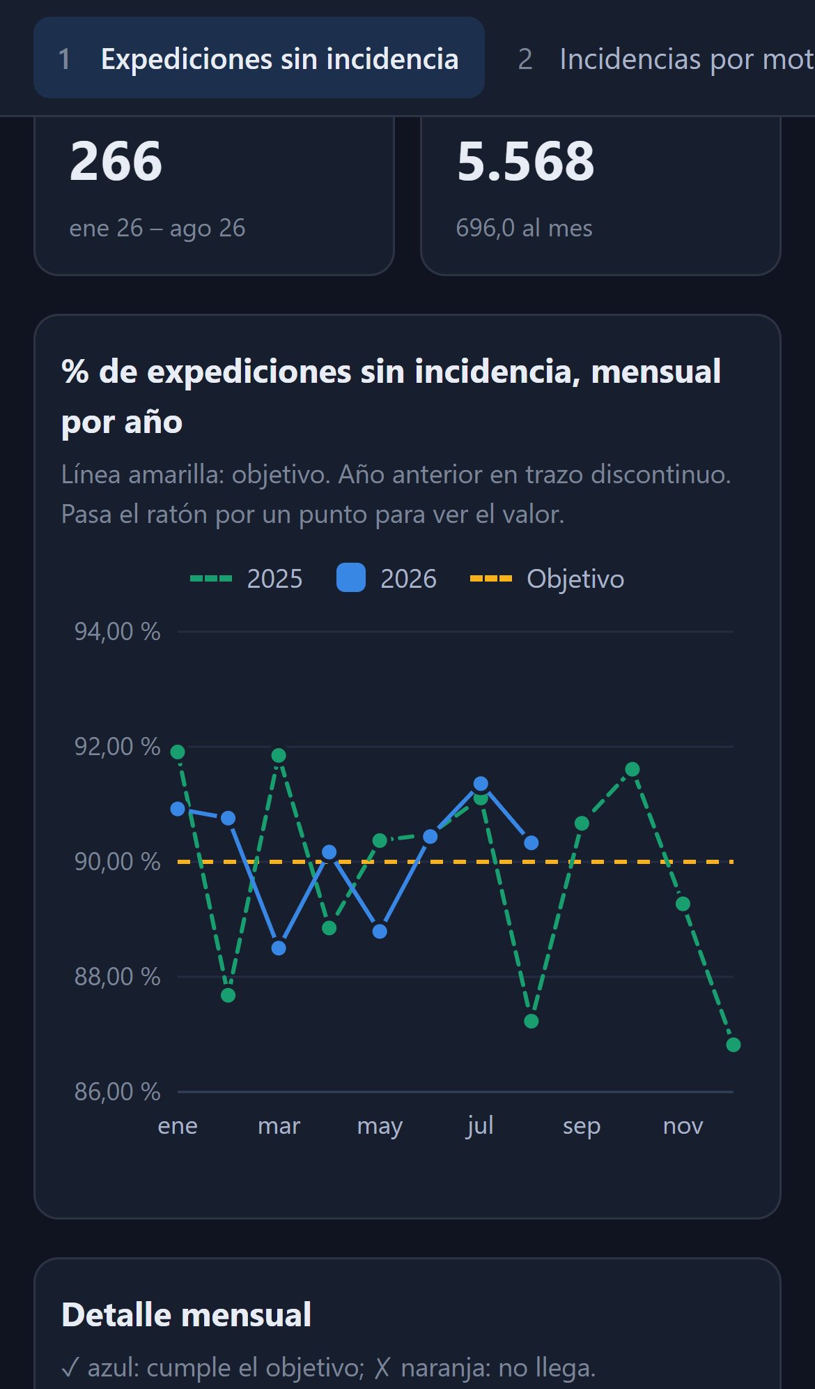
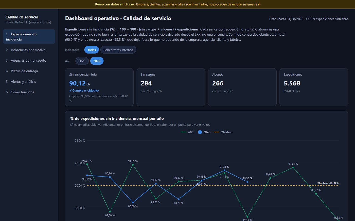
- Incident-free shipments: overall and internal errors only, each with its own target.
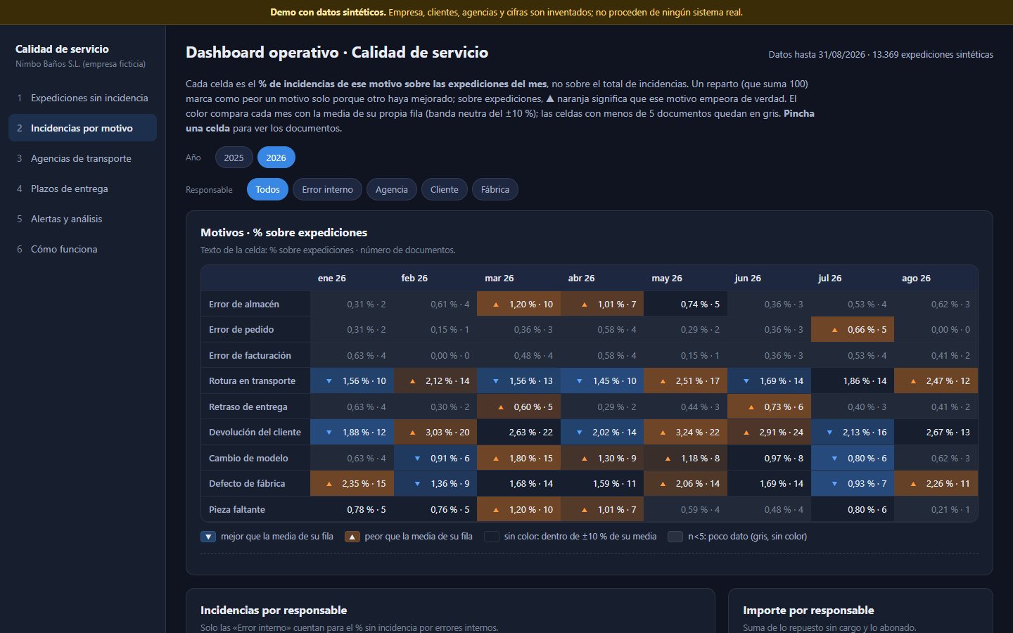
- Incidents by reason as a % of shipments, with the documents behind each cell.
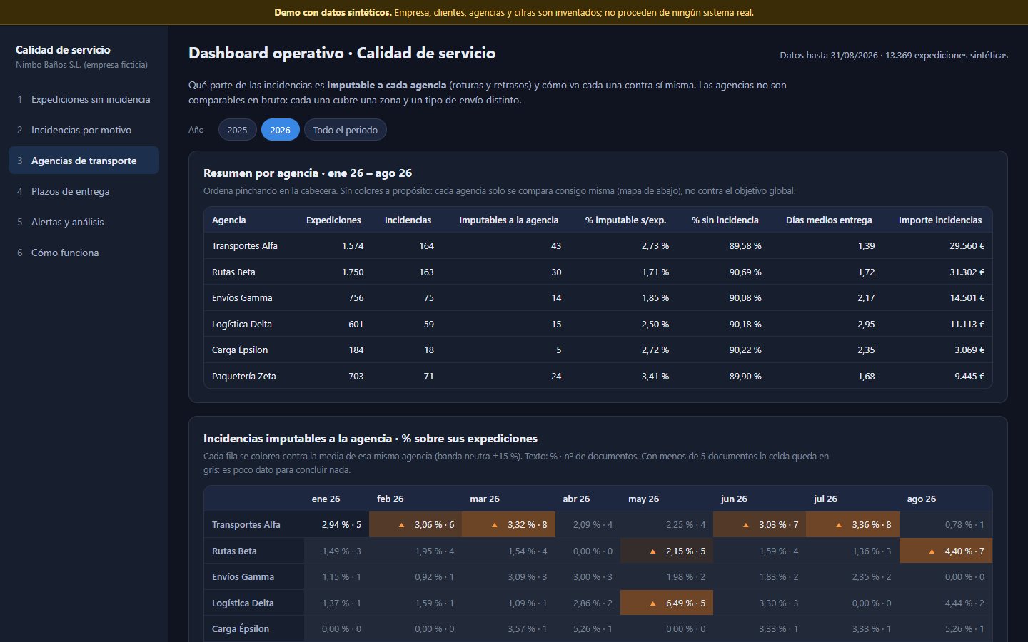
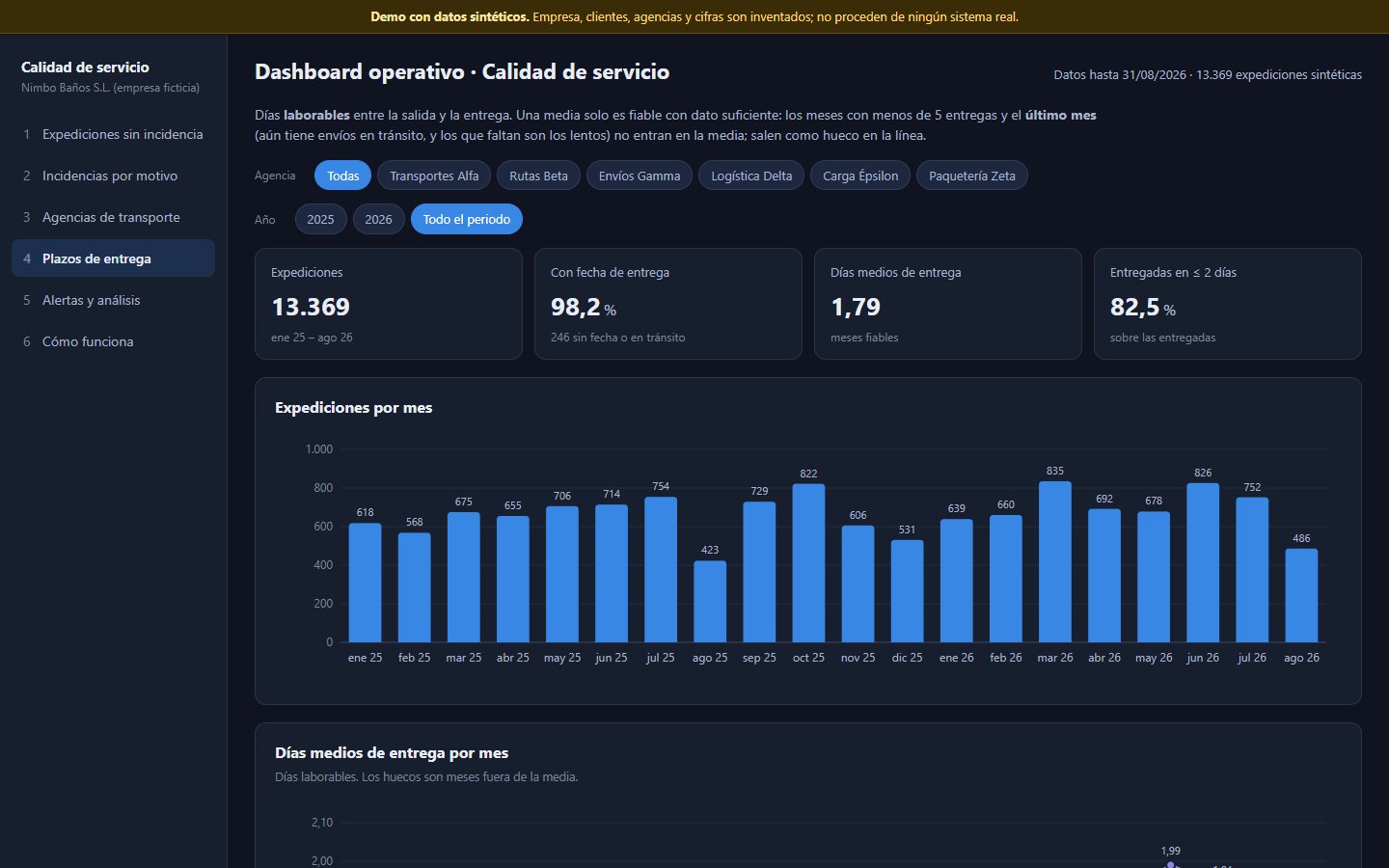
- Carriers and delivery times by carrier and province.
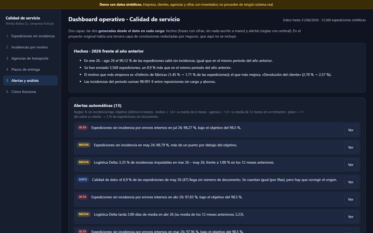
- Alerts and facts written from the data on every load.
Analysis decisions
- Percentage of shipments, not of total incidents. With a breakdown that adds up to 100, one reason turns red just because another improved. With shipments as the denominator, red means that reason is really getting worse.
- Each series is compared with itself, with a neutral band. A large carrier and a small one are not comparable in raw terms.
- Averages only with enough data. The current month is left out of the average delivery time: it is missing precisely the slow shipments.
- No hand-typed figures in the text. Facts are generated from the data and do not go stale.
Why not Power BI? It is still my tool for one-off analysis. Here I needed alerts, data freshness checks and the ability to open it from OneDrive without per-user licences.
Data quality
- Data error at source. A column arrived from the ERP formatted as a date and the count lost rows: one tab's indicator came out about 26 points below the real value. Since then the count is done by rows and there is a data quality alert.
- Contract between data and website. A test checks that the data file has the shape the website expects. A change in the generator cannot leave a tab blank without anyone noticing.
- Figures checked against closed months and already known totals before a change is accepted.
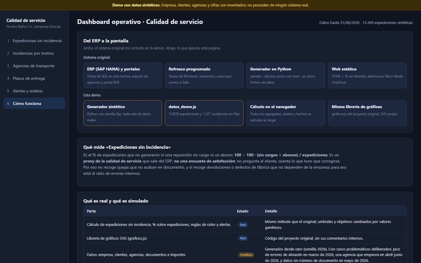
What is real and what is demo
| Part | In the demo | Detail |
|---|---|---|
| Shipment, incident and carrier data | Synthetic | Generated with a fixed seed, with planted anomalies. Downloadable as CSV. |
| Indicator formula and calculation method | Real | The same as the original; generic targets and thresholds. |
| SVG chart library | Real | Reused from the original. |
| B2B portal, workload, order forecasting, PDF report | Not included | 10 tabs from the original left out of the demo. |
| Python generator, SQL and email alerts | Not included | Described here; not published. |
Results
My own estimate: at least 5 hours a week that I used to spend exporting from SAP, moving the data to Excel, building charts and analysing them by hand. Now a scheduled ODBC export feeds the dashboard and it is up to date when I open it.
Limitations and next steps
- Alert thresholds are generic: with little data they also fire on noise. In the demo, cells with fewer than 5 documents are dimmed.
- The original lacks test coverage on the front end; what is tested is the Python calculation and the data contract.
- Next step: confidence intervals for low-volume rates and delivery time percentiles (P90).
Demo screenshots
All with synthetic data. The demo interface is in Spanish.